7 Ideas for Bringing Tasteful Color into Your Home
July 5th, 2021 | by Elizabeth | Posted in color
Hey, y’all! I’m back from High Point Market (the biggest design event of the year) and still reeling from all the incredible new pieces and styles I saw. From brilliant lighting to wallpaper as art to dazzling fabrics — in my opinion, it’s a great time to be a homeowner. 😉
The one thing there was no shortage of? Color!
While there wasn’t one specific color that stood out to me, I did see a split between warm, comforting tones (continuing the trend away from grays) and fresh, cool tones, like blues and greens… which y’all know is right up my alley! Of course, it all got me thinking about the color possibilities for your home and what you can do with it.
If you love the way color makes you feel, but you aren’t sure how to use it, today’s the day. I’m sharing 7 ways to embrace color in your home, along with several how-to tips to help guide y’all to doing it yourself! At the end, take a peek at some of my favorite picks for adding pops of color to your decor.
Y’all ready for a color adventure? Let’s go!
1. Paint the walls… or the ceiling!
The most obvious one first… painting your walls. For most of us with 1990s homes in Tennessee, Bassett Hall Gold (a sort of dark goldenrod color) is the standard. For 2000s homes, you may have walls in gray. I do think there are tasteful ways to do gray, but it’s been phasing out over the last few years. (I personally think grey can feel a little cold, but that’s just the Southerner in me.)
These days, design is leaning more toward crisp, clean beiges and other neutrals with blue and green undertones, like this one:
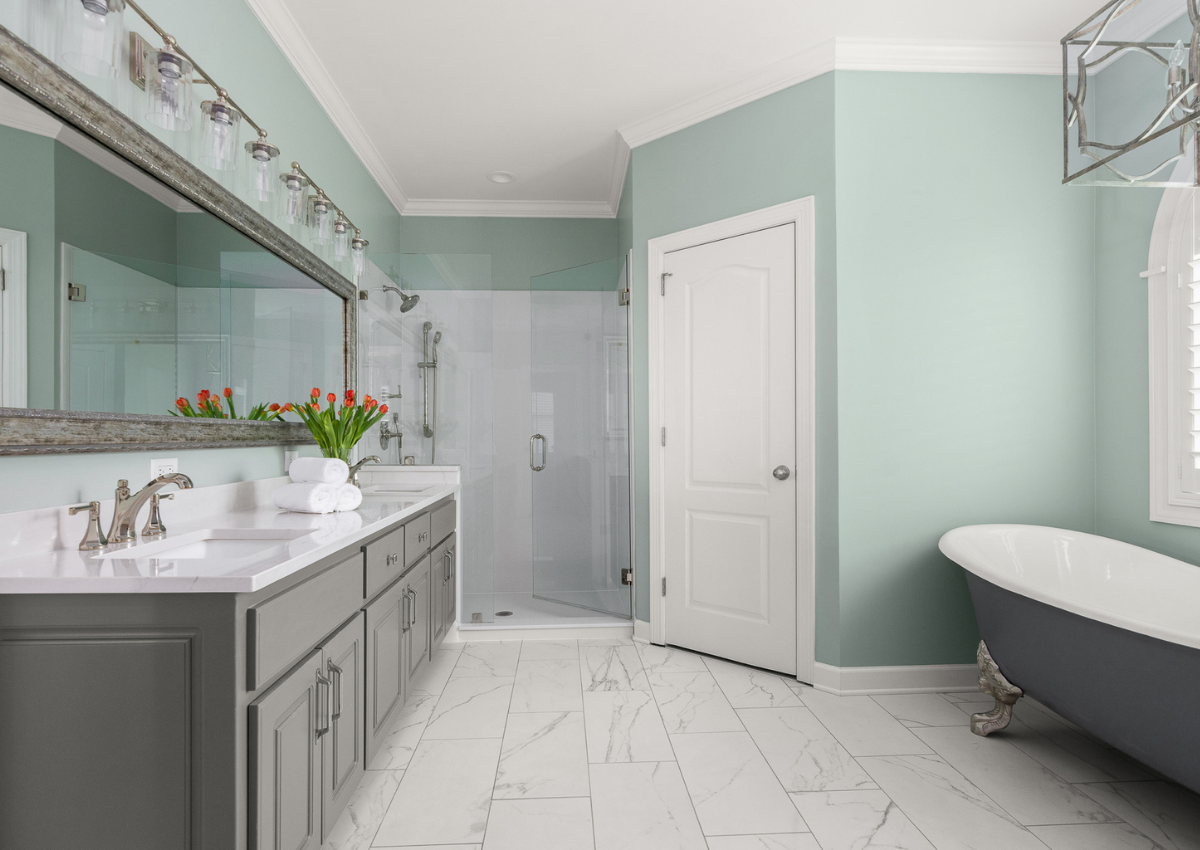
We painted this family room in Sherwin Williams Ancient Marble. It has a slight green undertone that keeps the space feeling open and fresh but far from boring. This master bathroom has blue undertone, and is Sherwin Williams Oyster Bay.
However, light neutrals — and walls — aren’t your only option when it comes to paint. For a more dramatic space, you could even paint the ceiling!
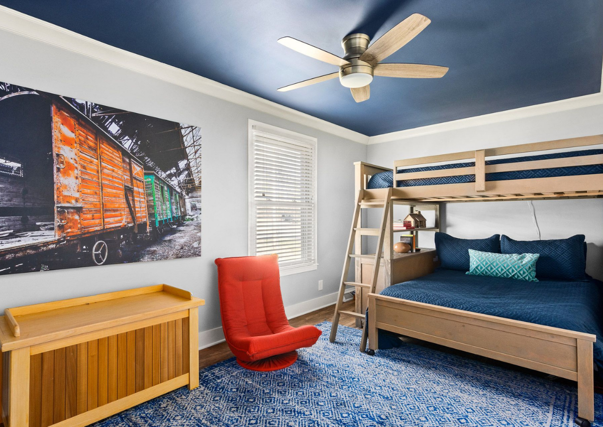
This teenage boy’s bedroom feels adventurous yet restful with deep blue tones balanced by pops of red and orange. Creative yet classic.
SC&D Tip: How should you test color?
Color is ever-changing based on the lighting, time of day, and what’s around it. Putting patches of color on the wall as a “tester” is no way to judge the color, because the color you are testing is always competing with the color that is already on the wall!
The only REAL way to judge the look of a color in your space is to compare and contrast it, and always use a truly white background. Also, always paint real paint samples (not just the printed versions) and look at them in different lighting at different times of the day. Believe me, they’ll change as the sun moves!
You can read more on how to select the right color for your space here.
2. Add color with wallpaper
We don’t use wallpaper a ton with our clients, (most are still too scared and have horror stories about removing wallpaper sometime in their past!) but if you ask me, it has a stunning effect! I actually used wallpaper in my own master bathroom remodel, and over a year later, I am still in love with it.
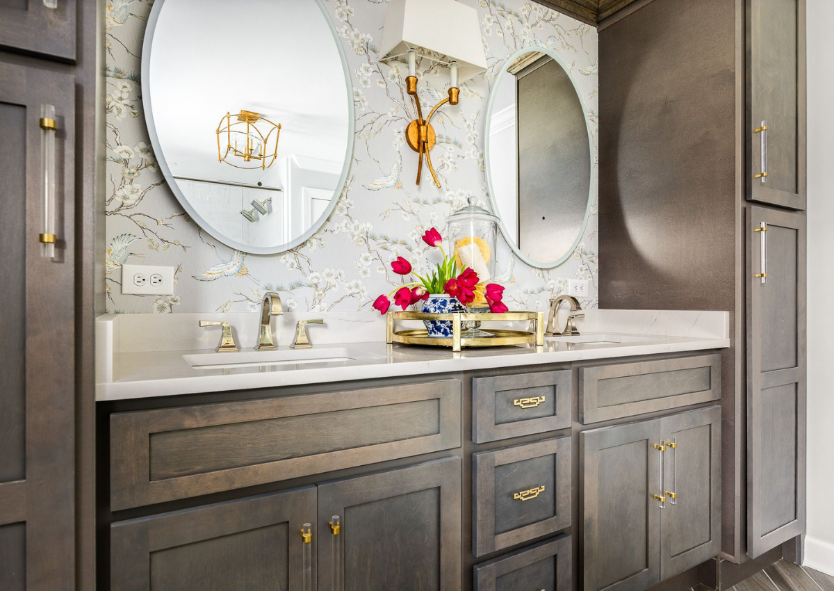
It’s not a “loud” wallpaper by any means, and it isn’t even the most dominant color in the space, but it definitely adds interest and supports the overall palette. Here’s a closeup…
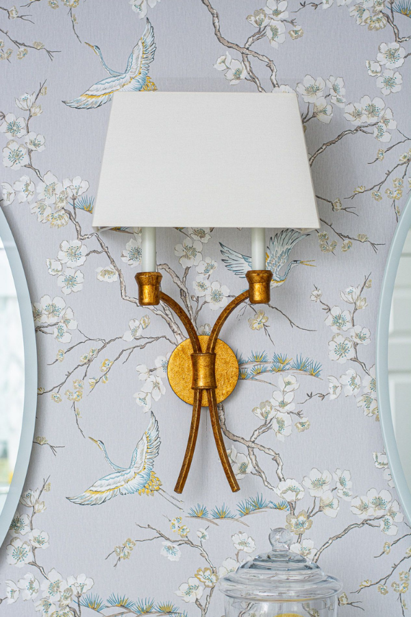
The background is a very, very light periwinkle color, and the cranes and cherry blossoms have a touch of yellow and blue throughout. You’ll notice that the accessories and hardware (more on that in a bit) play up these colors beautifully, which is the right way to do wallpaper!
I suggest prioritizing the design and movement of the wallpaper first (I find these majestic cranes in flight both soothing and inspiring). Then, look for one that supports the overall color palette you want to see in your space.
3. Incorporate color with a statement island
I love a statement island!! There’s just something so grand yet elegant about a good-looking island, and color is one way to bring it to life. Here are a couple examples…
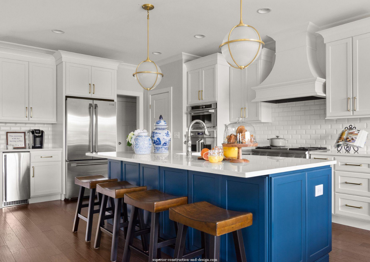
This kitchen island from our Pebble Point Lake House New Build is the perfect shade of cobalt blue. The kitchen looks out over their backyard and the lake, so this blue color helps bring the outdoors in. With a mostly white backdrop and touches of warmth in the brass lighting and barstools, the space is bold yet perfectly balanced and tasteful.
Not sure if one solid color is the best idea for your kitchen island? Here’s another idea…
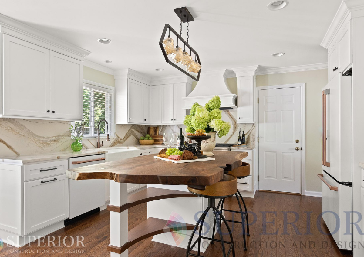
Wait, that island isn’t in a color — that’s wood, Elizabeth! You’re right, and a warm-toned slab of walnut at that. You don’t necessarily have to pick a color that’s on the color wheel. (Design rules were made to be broken just a little bit!) Even woods can bring a sense of color to the space. In this case, it’s warm, complementing the warm Cambria quartz and contrasting with cool pops of green.
If y’all know me, you know I love to mix both warm and cool in a space for a balance of cozy, welcoming, and fresh!
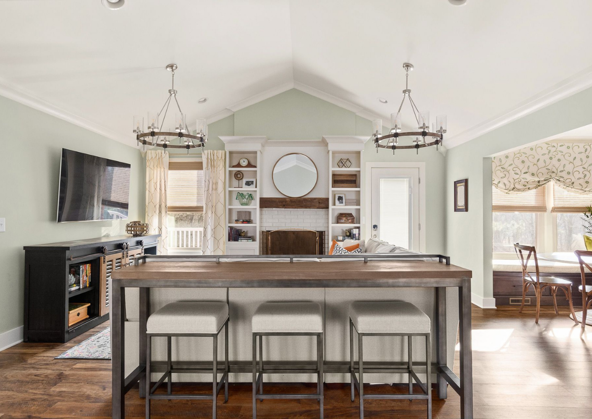
4. Invite color into the home with window treatments
Window treatments might be one of the most underestimated design elements in a room. They always seem to be an afterthought with homeowners, but they are essential for transforming a space — whether y’all are looking to add color or not.
Here’s what I mean…
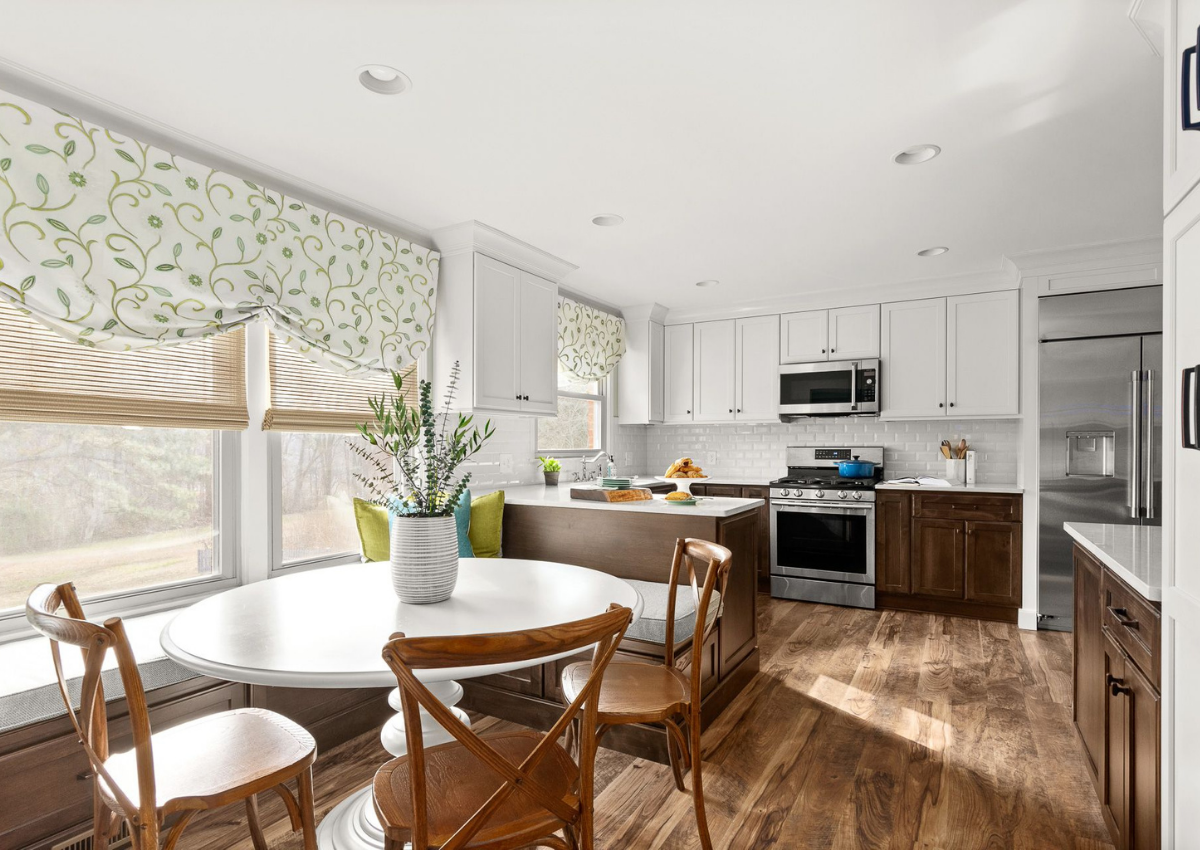
These window treatments not only bring color and softness into this kitchen, they also visually “raise the roof!” By installing them higher than the window frame, we create an illusion of height and, you guessed it, more spaciousness. Who doesn’t want that?!
From a color standpoint, the green and white pattern add a touch of freshness to this otherwise neutral kitchen. We played up the look with blue and green pillows. Simple, tasteful, and so easy!
SC&D Tip: Make sure to account for your fixed elements
All materials in your home have an undertone that leans cool or warm. It’s important to know when to mimic those undertones and when to complement them. In the case of the kitchen above, the flooring and lower cabinets are in a warm-toned wood — and in high volume in the space. This meant that our colors needed to lean cool (green and blue) to balance it all out.
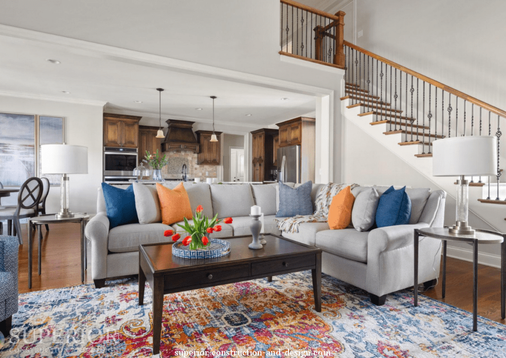
5. Create color harmony with an area rug
Rugs might be one of the easiest ways to add color to your home, and I personally love the effect of a vibrant patterned rug in a mostly neutral space. You can simply pick out the colors in the rug, use them in your accessories, and voila! — a perfectly harmonious space.
In our 1970s Ranch Reno, our clients knew they wanted some tasteful color in their family home. We kept the walls a cool neutral and brought in this warm, vibrant rug to spice things up. The oranges, yellows, and blues in the rug were then channeled into decorative pillows! A mix of fabrics in solids and patterns add extra excitement.
SC&D Tip: Always have a plan first.
The secret to a great design is having a plan. Most homeowners who try to design on their own will pick something out, add it to their space, see how it looks, and then go get the next item on their list. This almost always leads to a final result that doesn’t live up to expectations!
Designers do things differently. We create a plan from the beginning, mapping out the whole space, its color palette, and what will go in it (believe me y’all, depending on scope, this can take months to do). We only start purchasing items (or painting) after we have a great, comprehensive plan that we can see will work well together.
You can do the same, or reach out to us for some help.
6. Metals can add touches of color, too
While most metals have a warm or cool undertone, some — like brass — can feel like they add color, too. I know you already saw my master bathroom, but it’s a great example of what I mean:

The brass sconce, cabinet hardware, and tray bring warm gold tones into the room. You’ll also notice that the faucets are NOT brass. They’re actually polished nickel. Again, this was done to create balance. Faucets in brass would have made the gold color feel overpowering. Instead, it feels like an elegant accent not the main attraction. This is yet another reason that having a plan in advance is essential — you can discover these things before installing anything!
SC&D Tip: Mixing metals is okay.
The best way to mix metals is to pair — you guessed it — warm with cool. This means nickel and brass go together, but nickel and chrome do not go together. You can also mix/match the styles of hardware, like I did with the handles and pulls above!
7. Bring in colorful accessories and decor
This is probably the easiest and safest way to bring color into your home, and maybe you’ve even tried it before — adding colorful accessories and decor. I’ve shared quite a few spaces already that have a neutral base and colorful additions to liven things up, and I’m confident you can do the same.
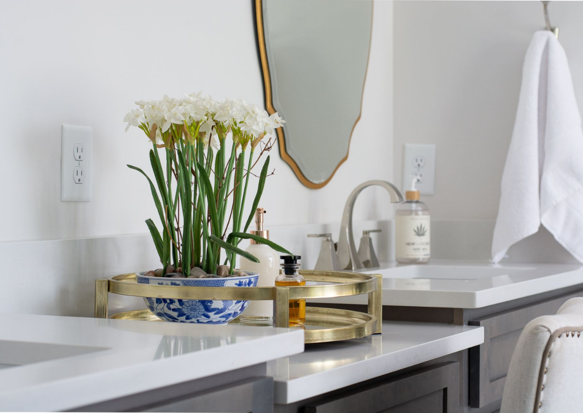
Predominantly white master bathroom? Add a tray, florals in a colorful vase (greenery also counts as color!), or a colorful soap dispenser.
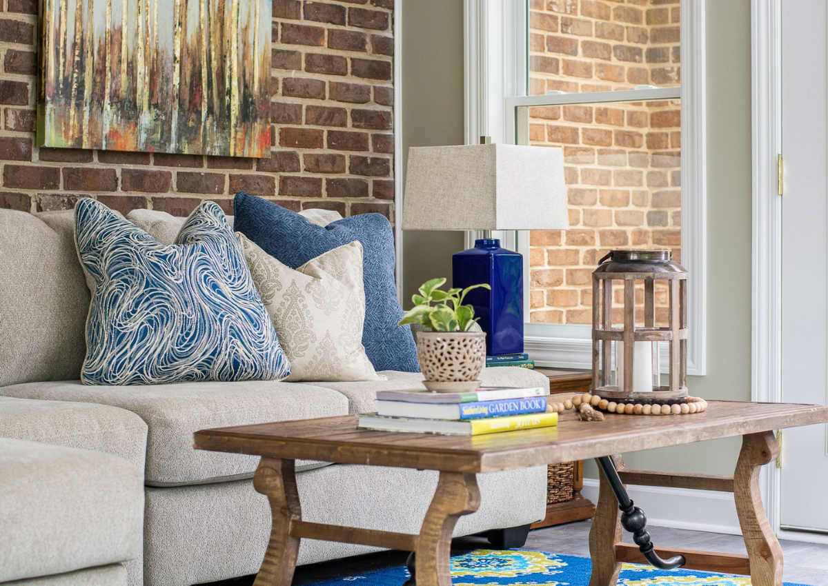
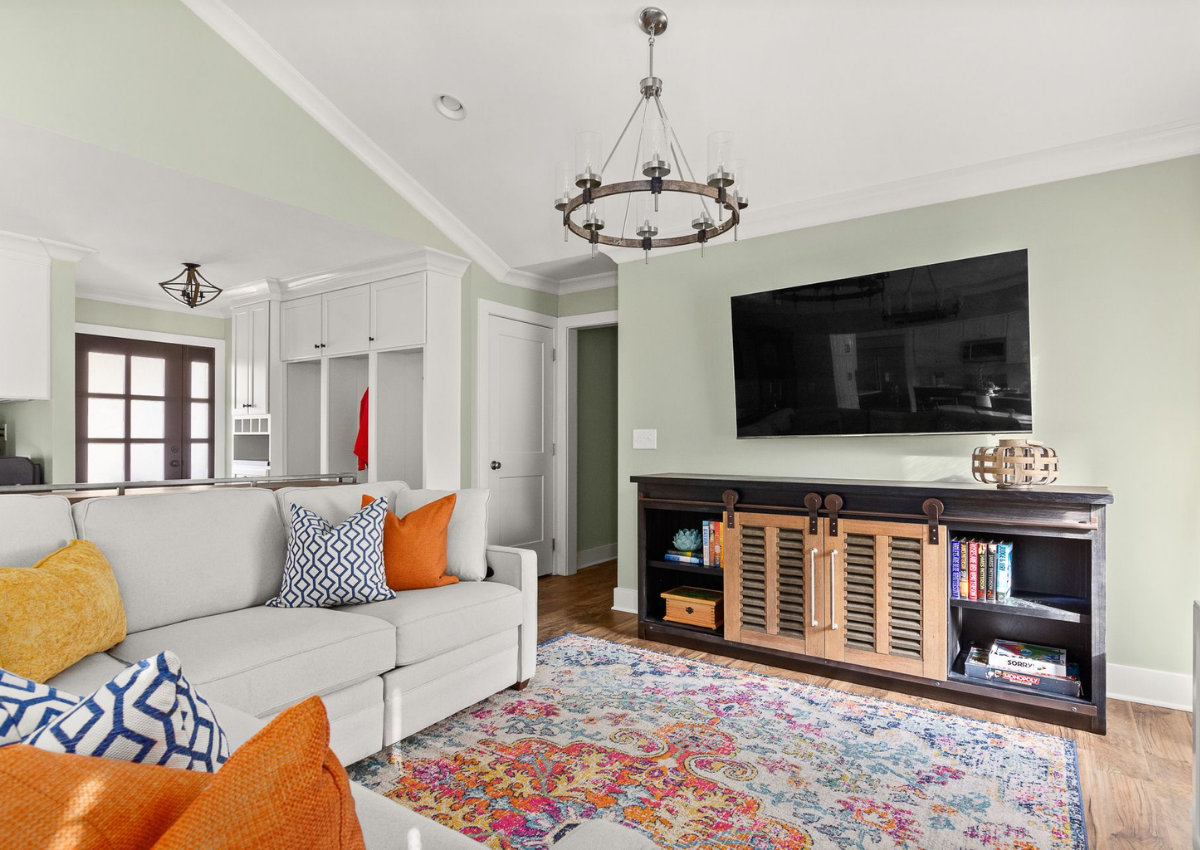
Looking to spruce up your living room? Decorate with coffee table decor, colorful lamps, and/or vibrant pillows. You can also add colorful art to the wall. Like rugs, art does a great job of creating color harmony between multiple colors in a space.
Color Inspiration
[show_boutique_widget id=”1069002″]
Final SC&D Tip: Less is more
If you’re a diehard color lover, you may not agree with this one, and that’s totally fine. But, if you love the projects in our portfolio, you’ll notice that they all have something in common: we use color minimally and impactfully.
The trick to color that really pops in your space is not overdoing it. As an accent, it has more pop! So, while I wouldn’t suggest using ALL of the 7 ideas and tips I’ve shared (you want colors to be harmonious, not competing for your attention), you can mix and match a few that feel exciting to you!
What’s next?
Not sure which colors to bring into your home? Start with some color exploration. Use Pinterest to save some of your favorite spaces. Tour a local botanical garden and take note of what your eyes are most attracted to. You could even go look in your closet to see what you’re attracted to.
Once you have an idea for your preferences, you’re ready to make a plan or call a pro. Feel free to ask your burning color questions below or reach out to me here for some advice or design help.
I love, love what I do and am happy to support you on your journey to creating a home filled with comfort, pride, and daily smiles — whether that includes color or not!
Xoxo,
E


