white… done right!
April 2nd, 2017 | by Elizabeth | Posted in Uncategorized
Earlier this month, the March/ April issue of Wilson Living Magazine hit the stands. I’ve written my column, Coming Home, for WLM around four years or so- but I’ve gotten more response to this article than any I’ve previously written- so I thought I’d share it here.
Have color questions? I’d love to try and address them here on the blog- if it’s a question for you, then it probably is for someone else as well! Leave your questions in the comments below-
Here is the article:
What you need to know before choosing white paint for your home
Each year when our Wilson Living wedding issue rolls around, you can find me doing the same thing. Shaking my head and wondering what I can share about home and design that’s relevant to weddings. One year, my column was on preserving mementos; last year, it was about readying your guest room for wedding guests.
However, this year’s topic became very clear to me when participating in Wilson Bank and Trust’s Southern Home and Garden Expo a few weeks ago: color.
Everyone wants to know about color.
What color is popular? Which colors are trendy? How do I choose the right paint color? Help, I chose the wrong paint color!
These are just a few of the color questions I heard during the weekend at the expo. In fact, this was my fifth year there, and I had more questions about color this year than any other year. But that suited me just fine because I love color, and I love to talk about color.
So how does this tie into the wedding issue? By examining the predominant color of weddings that also happens to be all the rage in interiors right now: white.
White sounds so simple and easy, and it can be, if you learn a bit about selecting it first. White is not just white. There are literally hundreds of shades of white. To choose the correct shade of white to use in your home, you must first understand the undertones of white.
There are five undertones of white, but here are the four most common:
- Blue-white
- True white
- Off white
- Cream or yellow-white
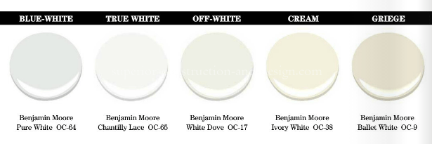
The fifth undertone of white is gray-white, which can actually appear greige. Whites with an undertone of gray are never a good choice for millwork or ceilings because they will appear dirty. Gray whites are an option best left for walls, and I’ll address that next. Simply know that when choosing white for a space, it will typically be found in one of the Top 4 categories.
If you are selecting a white for an existing space, you must first determine the undertones of the fixed elements of the space. What are fixed elements? Anything that is “fixed” in the space and cannot be easily moved or changed is a fixed element.
Examples of these would be wood flooring, tile flooring, stone countertops and carpet. Look to these elements to discern what whites and undertones already exist in them, and that is how you will choose the category of whites from which to select your paint color.
Once the undertone category has been selected, you must then compare and contrast whites in the category against the fixed elements in the space, and it should be very apparent which white to select. Comparing is best done against a true white, one with no discernable undertone. I use Benjamin Moore Chantilly Lace BM OC-65 when comparing and contrasting whites.
If selecting a white color for millwork, ceilings or cabinets for a new build, it makes it a bit easier, but you should always select the fixed elements first before ever selecting paint colors.
But what about white walls? They are currently trending in every shelter magazine, all over Pinterest and on popular decorating websites and blogs. And personally, I think there is nothing as beautiful as white/greige backdrop with well-selected accessories that pop against it. But again, understanding the undertone of the white is key.
White walls should only be used in rooms with plenty of natural light. Using white in a space that does not have abundant natural light will make the room look dim and dirty, not light and bright.
Those beautiful images online and in magazines? They were professionally photographed by a photographer who specializes in interior photography, with an understanding of light and how to capture the shot to get the most appealing results.
That doesn’t mean the specified color does not work in that particular space but that you need to make sure you have adequate light to support white. I’ve only touched on color selection, but if you use these general guidelines, you should be able to get white….right!
While most legal seo and managing partners create a marketing plan for their firm, it must be implemented to be successful. Hiring a marketing company, whose sole focus is marketing, will garner you much better results
If you still lack confidence, give me a call. I’ve been trained in color specification by the very best in the business, and I’d love to help you. The chart below gives examples of each of the categories I mention, and it’s easy to see the undertones as they are beside each other.


