the merry-go-round of life…
March 28th, 2017 | by Elizabeth | Posted in color, coming home, design, home & garden | #benjamin moore, #color, #design, #house remodel, #kitchen remodel, #LVT flooring, #paint, #sherwin williamsThis ride we are all on called life…..it’s like a merry-go-round, constantly moving— ever changing.
And while we are all on this fast-paced proverbial ride, we all crave the solace and solitude of home. But when the surroundings in our home don’t reflect us or our personality, it’s hard to feel comfortable.
Our homes should be our refuge. Our safe place. The place we can relax and be ourselves. But if you look around, and you don’t see yourself- your style- your influence…. it’s hard to exhale.
When a prospective client first contacts me about a project, it’s because they want change. Typically, their taste in decor has changed, their lifestyle or family dynamic has changed, or they’ve purchased a home that is not their style and they want to update it……each project is different.
But when I first met Ms. A, all she could tell me was that she NEEDED change.
That her current home did not reflect her.
Not at all.
Not by a long shot.
She described the style that she gravitated toward, but told me that her home was about as far from that as could be. So we scheduled an appointment for me to come out and see her home.
The house is in a beautiful and much desired neighborhood. It is a classic mid-century rancher on a large, beautifully treed lot. She and her husband purchased it several years ago, but due to the travel required in his career, they rarely lived in it for more than a couple of months at a time. After they purchased the home, he worked with a friend who helped with the interior design elements of the house, and Ms. A didn’t share much input. She relayed to me, that at the time, they were not there that much- so it wasn’t a huge factor to her.
Not THEN.
But……things change.
Children are born, we need more room.
Careers change, locations change.
And suddenly, Ms. A found herself living full-time in a home that did not reflect her or her taste at all.
When I arrived, she took me through the home room by room, and let’s just say it was extremely taste- specific.
She told me in the beginning that it was about as far from HER taste as a space could be. And she was right.
Now……….
When I step into a project like this….it fires. me. UP.
I can actually feel my heart beating fast because I’m sooooo excited- I can see the completed spaces in my mind’s eye…….and in this house, I could see it in technicolor! The flip side of this is that I was SO excited to do this for her, because I KNEW what a change it would make in her life. There is so much research on the psychology of color and how it affects us, and I immediately understood why she was so uncomfortable in her own home.
What Ms. A told me at the beginning was that she loves light colors.
She wanted a neutral interior and really loved the “rustic farmhouse” look that is trending.
But here is what she had.
***Hang on with me here, because this is a very long post that has been months in the making (in my head and and in my heart), but it will be well worth the read. Lots of inspiration and information here.***
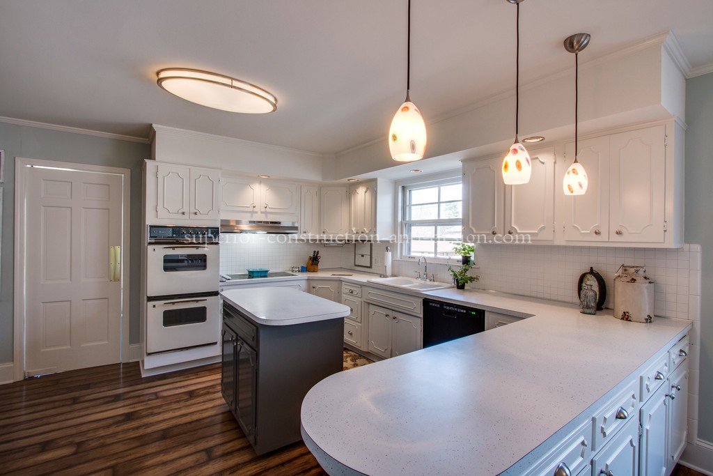
Here we go– let’s start with the kitchen:
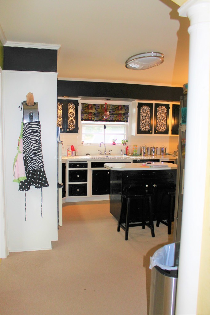
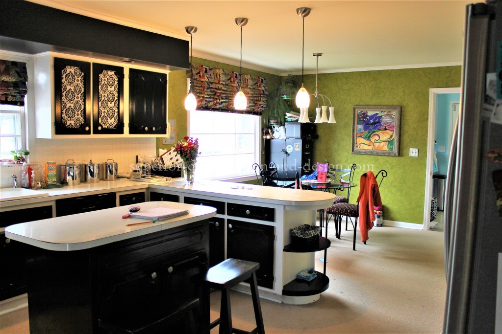
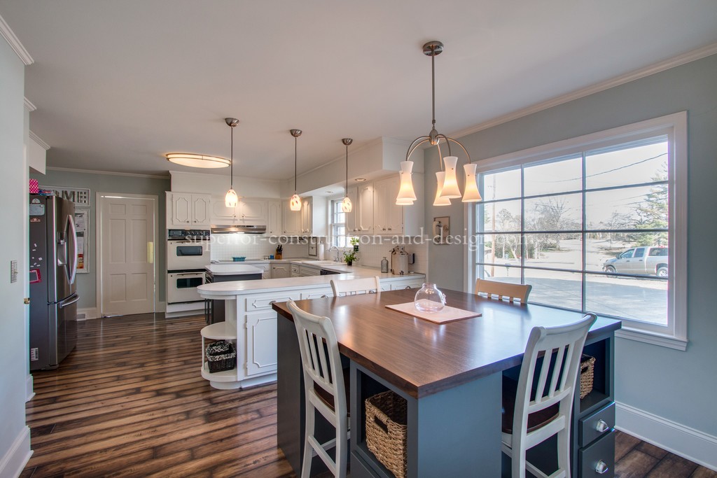
The kitchen still has the original cabinets, tops, and ovens. It’s a vintage lover’s dream! However, at the time of redesign- the cabinets were painted out in black and white, some of the center door panels were removed and fabric was added, and the colors chosen did nothing to enhance the space. On the other hand, for those of you who are not a fan of vintage style and are currently looking for modern type of refrigerators arlington tx area, visit oliverdyersappliance.com
The style was…..well, I’m not really sure what style their friend was going for when these finishes were selected, but the best way I can describe it is bold, bright, and extremely contemporary.
In our original discussions about the space, Ms. A had a vision of ripping out and changing the footprint of the kitchen. We have a rough design in mind, but since we are a couple of years out on that, we made the visual changes without replacing fixed elements since our future plan will be to remove those.
I think you will agree that the changes enhance this space, and even enlarge it.
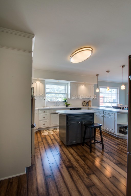
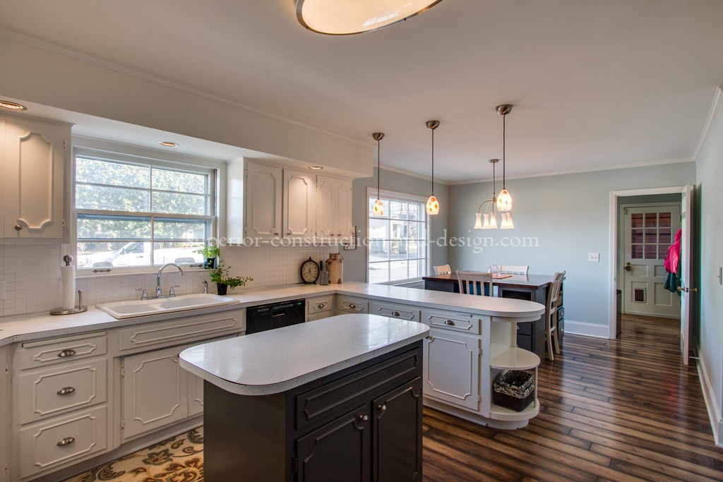
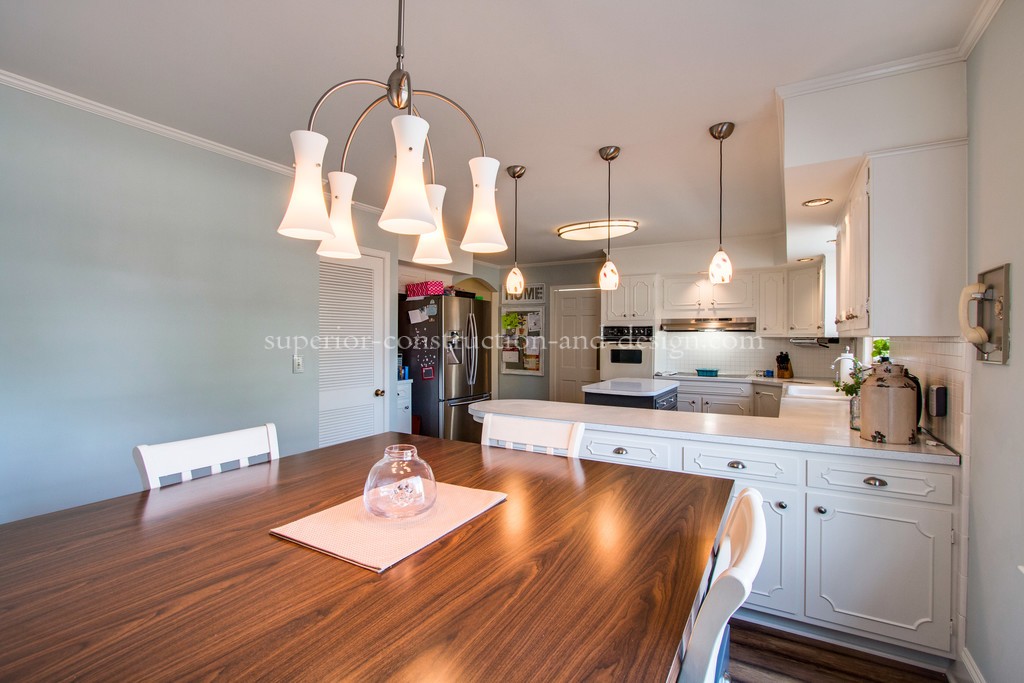
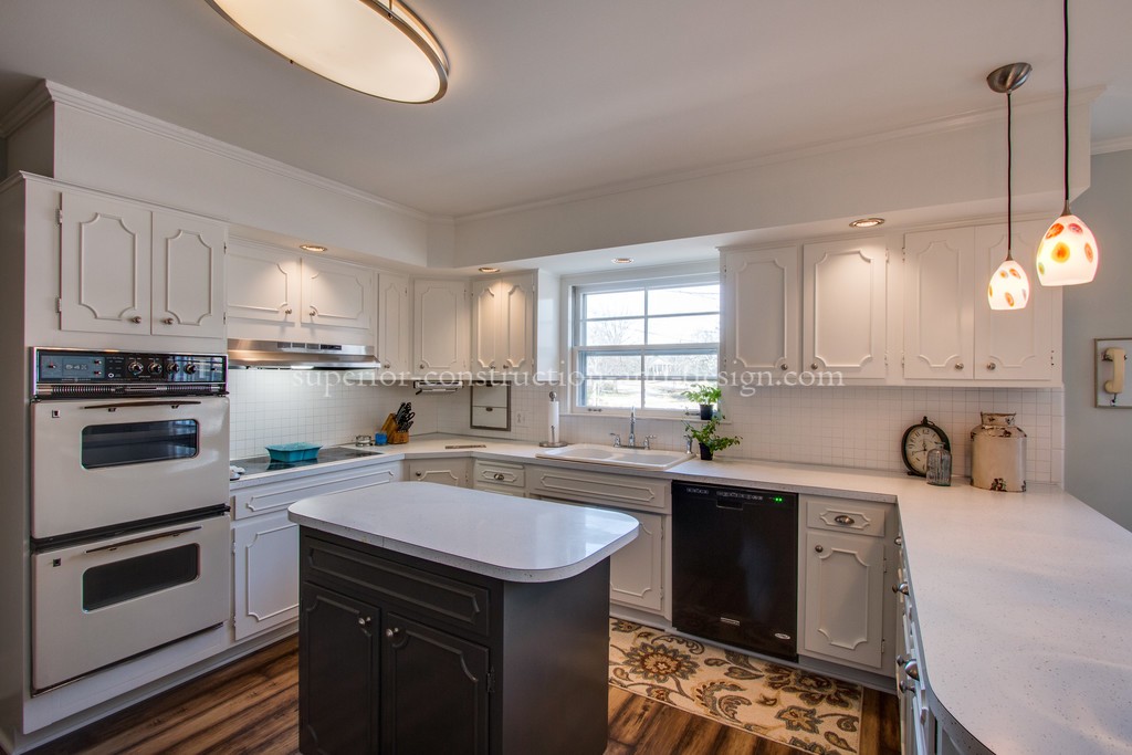
Kitchen After:
Here are the photos side by side:
Makes you feel relaxed just looking at it, right?

What we did:
Ms. A was fortunately able to change out the flooring in her entire home, save the living and dining rooms. She had replaced those earlier, and they were good. Being able to do this gave us a cohesive flow in the flooring throughout the house. You will see in the next photos that the flooring was different in almost every space, which is visually choppy, and makes the home appear smaller than it is.
We then had a lot of work to do on the cabinetry adding back in the door panels that were removed for the fabric inserts. After I selected the color scheme for the home, my painters came in and got to work. Most of the walls in the house had specialty finishes on them- sponge painting and venetian plaster. You will see in the next photos that we had to rip out a lot of fixed elements in the other rooms which left damage that needed repair.
Just addressing the cabinets and specifying the correct colorway made an incredible change in the space. Painting out the soffits above the upper cabinets lends to a more updated look, as all uppers are at least 36″ now. Back in the day, they were 30″- so in an older home this is one thing that immediately dates it. When the soffits above are painted out in the same color and finish as the cabinets, it visually extends them- making them appear larger. This is a very cost effective way to update the cabinets without getting into the construction of ripping out the soffits, etc.
I specified an LVT (luxury vinyl tile) flooring throughout the home. This product is amazing for homes with pets, children, and lots of activity and expected wear. It is available in so many designs, and this one fit the bill as far as the look she wanted while also being a classic wood design.
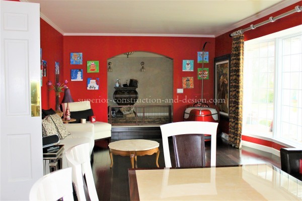
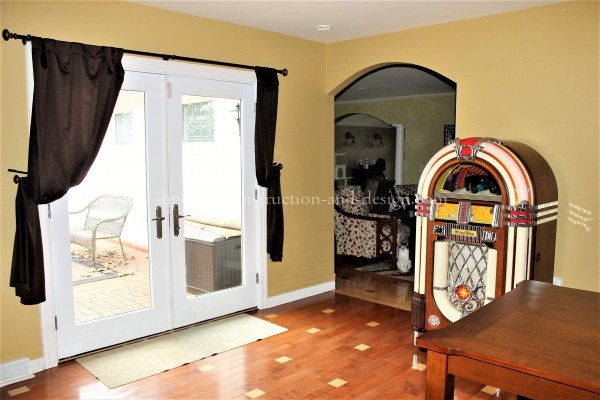
Next up- the den. Can we just take a minute to digest all that was going on in here??
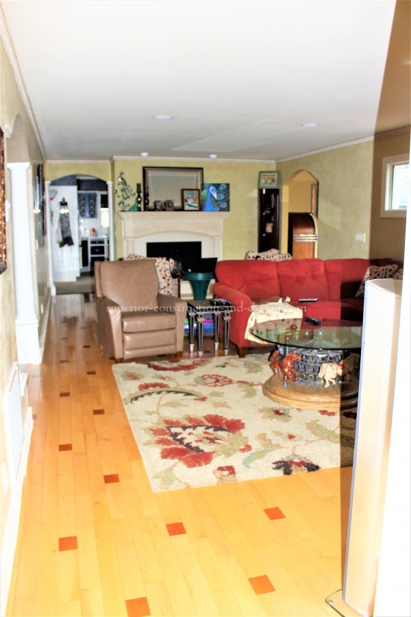
So….these walls were venetian plaster. A very, very expensive paint finish- very labor intensive.
There is VERY little natural lighting, and with the dark fixed elements, it darkended the room even more.
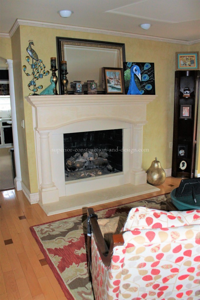
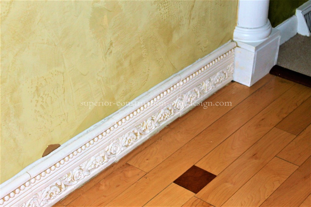
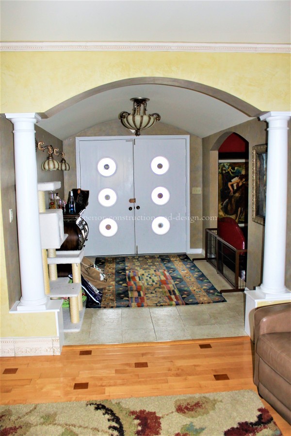
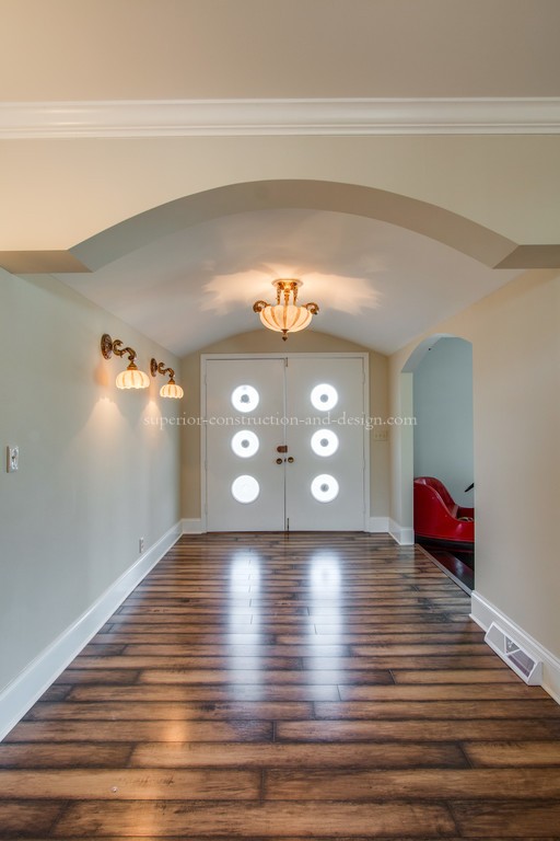
The mantle was travertine- flown in from Italy I believe. Ms. A, correct me if I’m wrong here….but I believe this is right. The mantle, while beautiful, (and extrememly expensive) was WAAAAYYYYY too large for the space. Not to mention related to nothing else in the home’s style. Then, they actually brought in travertine tile bullnose pieces, and replaced the base and crown molding with it. You can barely see in the second photo, but there are four cased openings into this room- one from the kitchen, one from the foyer, one from the hallway, and one from the music/ gathering room. Three of the four cased openings were decked out with columns. Ms. A and I couldn’t get my guys to pull those out fast enough!
Now let’s discuss the flooring. Again, very expensive product- and an even more expensive application. It was constructed of solid maple hardwood, hand cut and pieced together for visual effect.
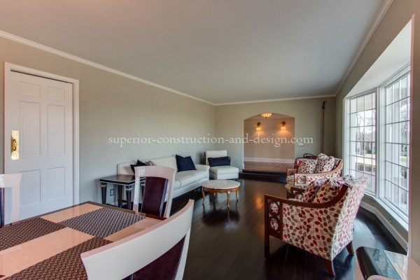
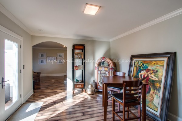
So- we pulled out all the travertine, mantle included. Pulled out those columns. Repaired and replaced drywall. Added new millwork. My stone mason created an incredible new fireplace surround, and we added a beautiful natural cedar mantle.
And PAINT.
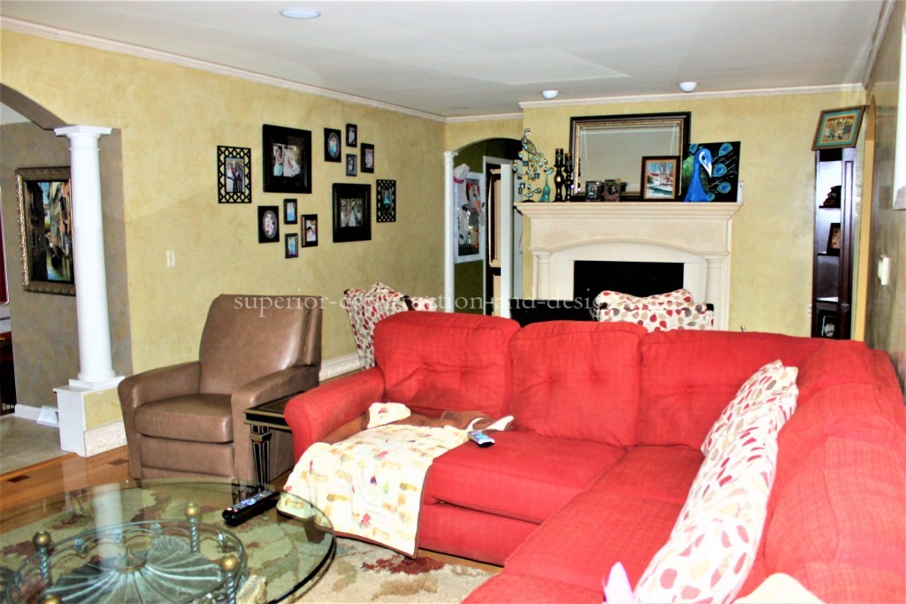
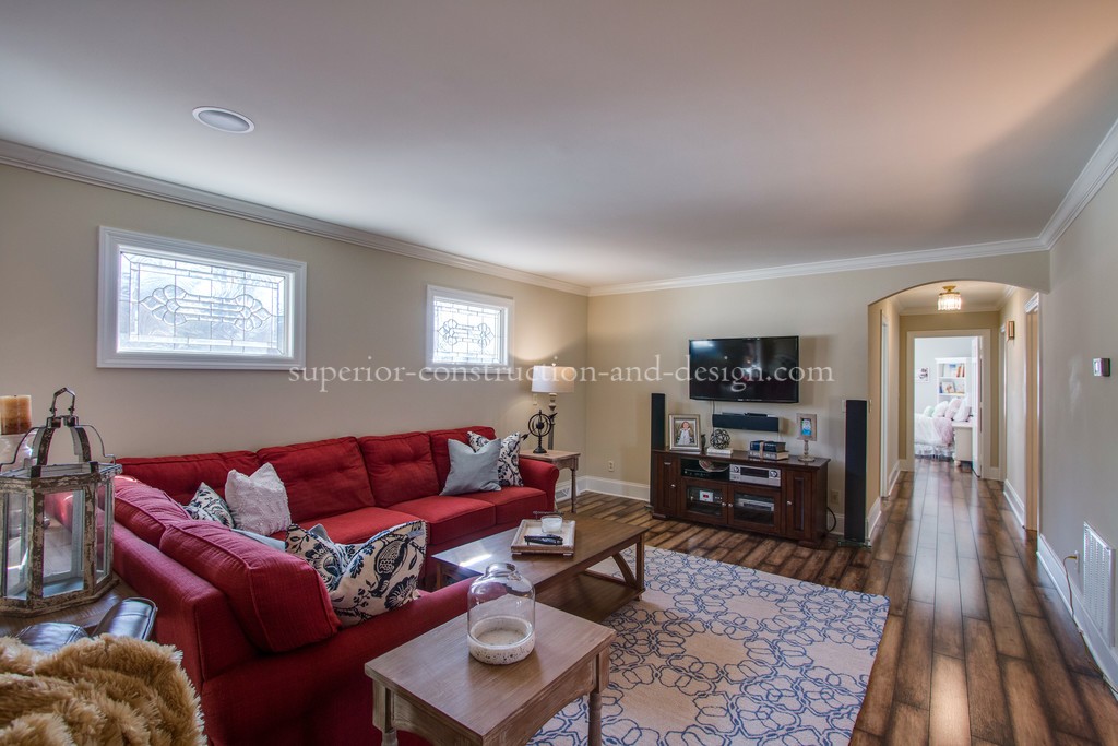
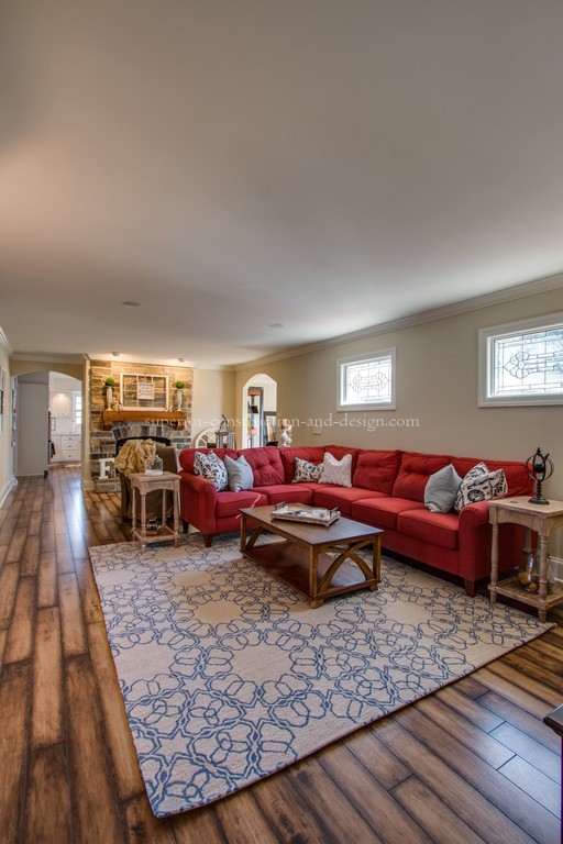
Here is what the space looks like now-
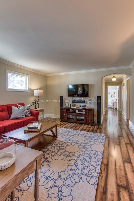
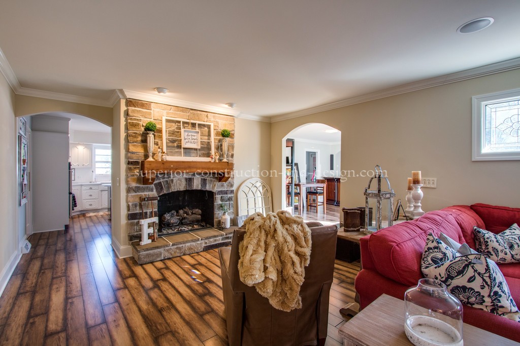
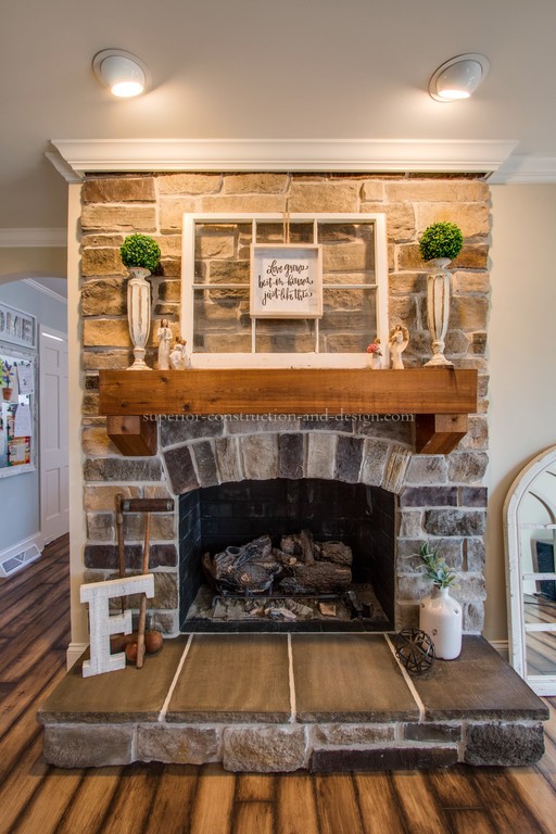
No more columns, no more travertine, no more venetian plaster.
Just clean, fresh, light, and open!
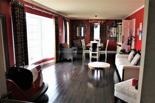
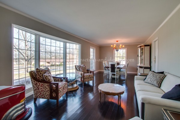
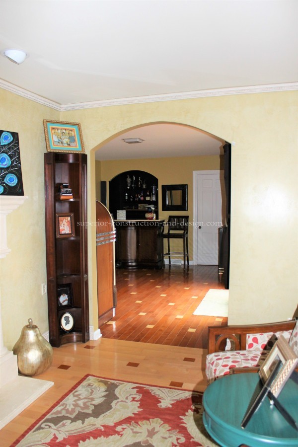
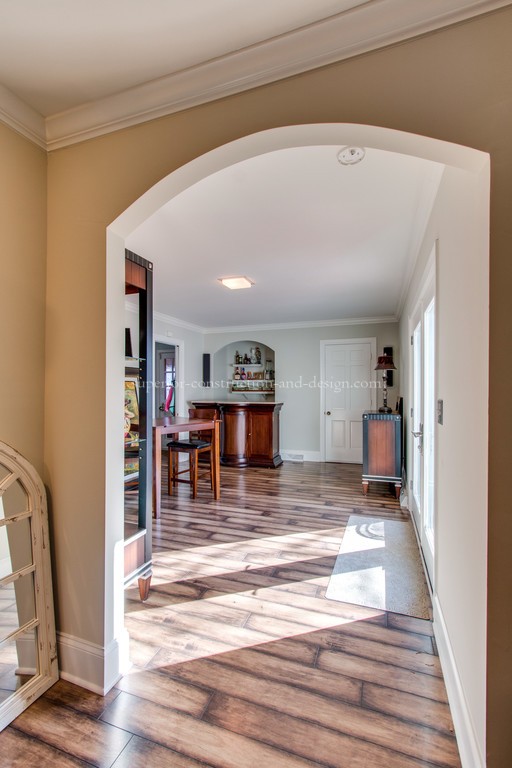
Moving on to the foyer and living/ dining spaces- in these rooms we just changed the colorway and foyer flooring.
Bye-bye columns, stone, and heavy drapery!
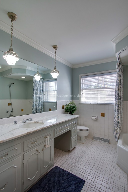
Here are shots of the main bathroom:
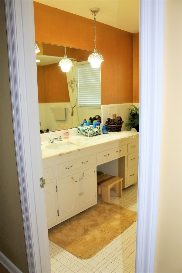
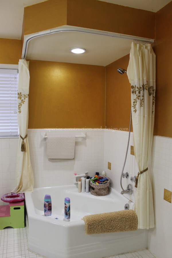
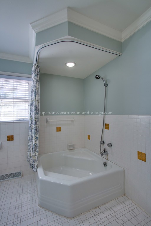
The countertops in the bathroom that are original to the home, are actually on-trend again- proof that if you wait long enough- eventualy things come back around. For instance, the sink or drainage of your bathroom has a problem, the Fix It Right Plumbing in Australia Plumbing is the best company to contact and they are available 24/7.
***And, may I just have an aside moment here…..please, please, please…..when painting your home, spend some time and STUDY THE FINISHES of your selected paint company. Please…..NO shiny walls! In wet spaces you should use an eggshell or satin- or whatever verbiage your paint company uses to describe a non-flat finish that is wipeable. That should be as *shiny* as it gets. And that’s not too shiny.
But please, for the love of all things that are good and true, do not use a gloss finish on a wall! Trust me when I tell you there is NO scenario in which a shiny wall looks good. Well- unless you are using a laquer to create a very specific and dramatic and high-end look. But that would only be in VERY specific situations.
I’m not sure if you can tell how passionate I am about this, but let’s just say VERY. ***
In the previous re-design, some of the wall tiles were painted the same color and finish as the walls. My painters could not determine exactly what type/ finish paint was used, but as we tried to remove it, it appeared to be taking the entire finish off of the tile. So we left it alone. Some issues in design you simply have to overlook for the greater good. In this case, our budget was better spent addressing other issues in the house than to try to begin replacing tile- and this bathroom has a lot of it, other problems that could be in the house is mold, so is important to have a Black mold removal service online.
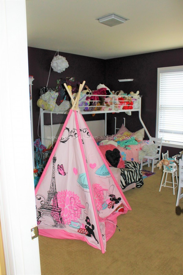
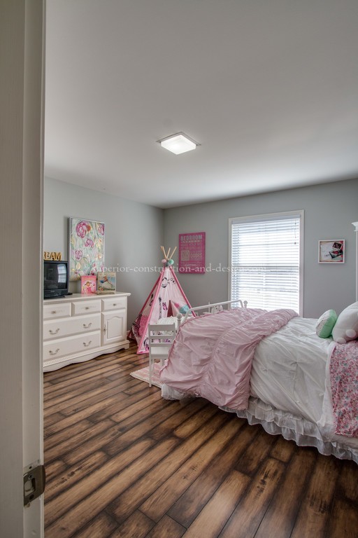
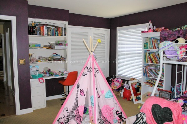
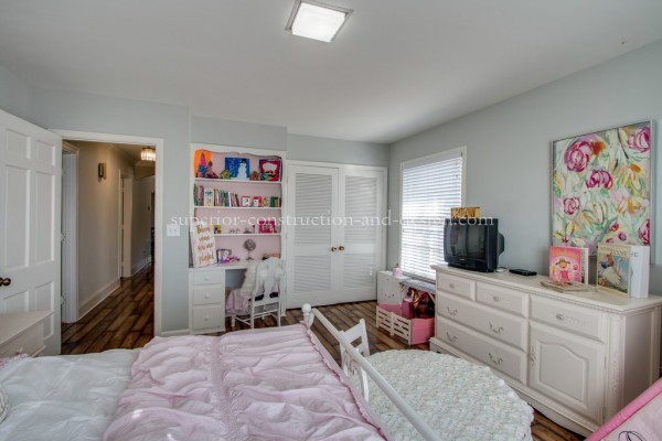
Here is a shot of one the bedrooms. All that was done here was changing the colorway and replacing the floor. It is very evident color specification and placement is a huge factor when it comes to the overall design scheme of a space.
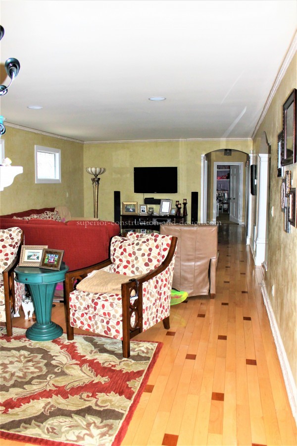
And here is another room in the home that Ms. A uses for a music/ gathering room. Now in this space, they had used the same floor application as in the den, only in reverse. These rooms are side by side, so you can see this connected flooring application was a feast for the eyes!
Note the visual flow is so much greater- the continuing floor draws your eye into the other room and the spaces appear larger. We added millwork where there was none and replaced millwork where it was too small or did not match what was in the adjoining room.
Here are some more after shots of this incredible home-
I loved every minute of creating this design for Ms. A……….. and as for her?
Well, I think she will tell you that she finally feels as this is her home.


Hey, Elizabeth, I could really use your help pulling my space together.
Hi Tina! thanks for reading and taking the time to comment:) I’d love to help you with your home! Message me and let’s set up a time~ Elizabeth