there’s magic in paint…
July 28th, 2016 | by Elizabeth| Posted in coming home, home & gardenI think most of us would agree that when it comes to transforming a space, the quickest (and oftentimes least expensive) way, is with color. A $30 gallon of paint holds within its realm so much possibility. Fresh, new, possibility—and this is the time of year we all want that!
Color is such a powerful thing. It has the ability to affect our mood, our thinking, and even how we associate things with one another. That’s why I’m always baffled when someone puts more thought into what they are having for lunch than what colors they are going to paint their home.
A few of the most often asked questions I receive are these: “What color should I paint my ______?” (You fill in the blank.) Or, “What color is popular right now?” (Really? You want to paint your home the “popular” color?) And the best one is this: “I saw this new paint color in my friend’s house, and it was FABULOUS! Just fabulous I tell ya! So I painted my den the same color and it’s AWFUL! They must have mixed it wrong… it looks nothing like her house!”
Let me fill you in on a little secret… there is no magic paint color. Sorry to be the bearer of bad news, but it doesn’t work that way. What you have to discern when painting a space is undertone and placement. THIS is the secret. This is why your friend’s color doesn’t look good in your space. If you don’t take into consideration the undertones of the fixed elements in the space, the lighting and its direction in the space, and the placement of the color in the space; it will read wrong every single time.
Here are a few examples on one of my current jobs. My client has lived in her beautiful home for a couple of years, and she was so spot-on in the selection of all her mill work and detailing of her new build . However, when I initially consulted with her, she said it she didn’t feel as if it were warm or pulled-together. As we walked room to room, she began to tell me she didn’t like this color or that color, and before leaving she asked me to paint wherever I felt might need a fresh look. It wasn’t that she needed a fresh look, it was that the colors chosen needed to work cohesively with the beautiful detailing of the home.
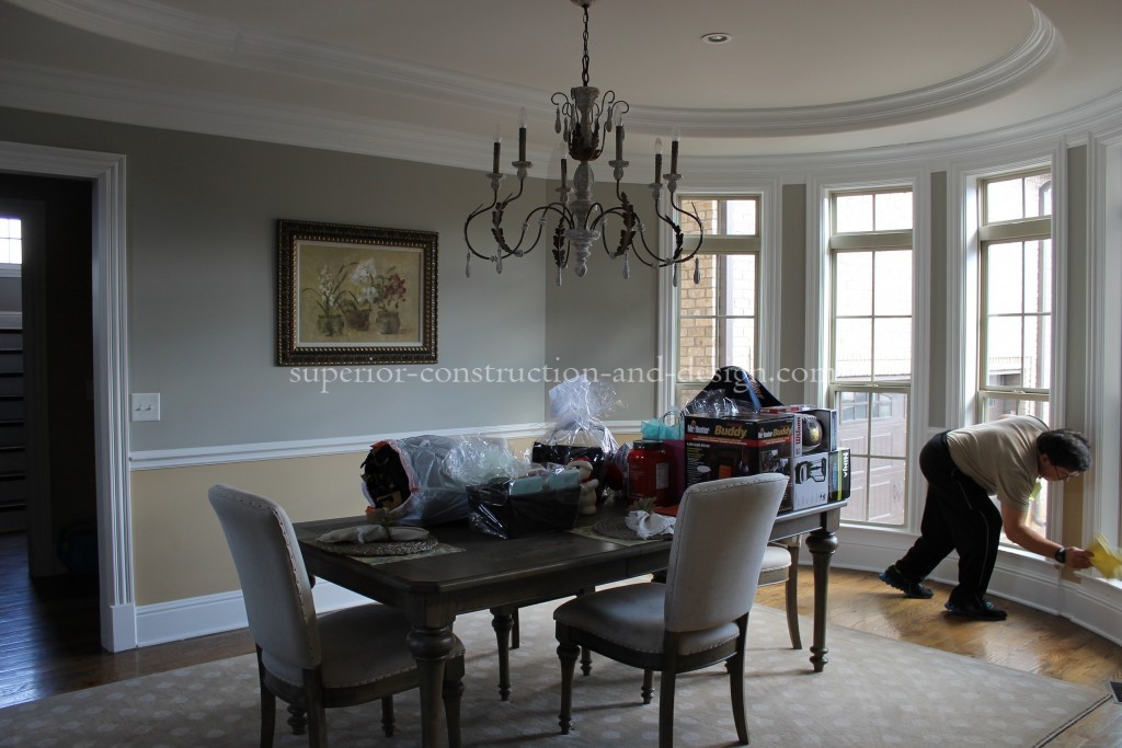
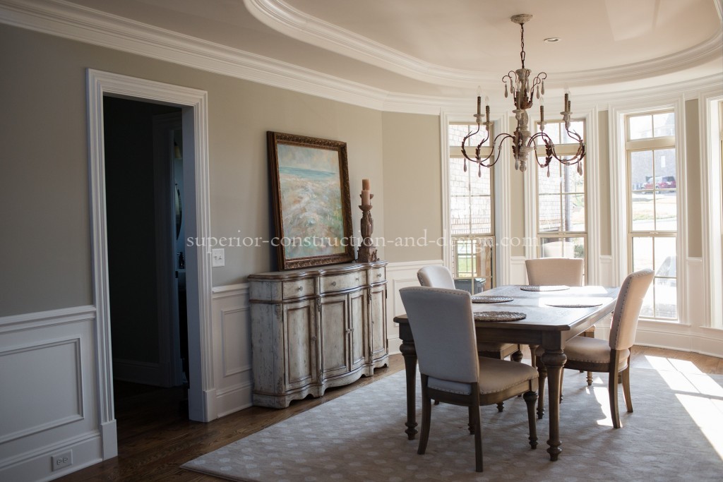
DINING ROOM
The first room you see when entering the home is this beautiful dining room with a radius window wall and curved tray ceiling. However, instead of noticing the detailing in the windows and radius, your eye is drawn to the division in the wall with contrasting warm and cool colors working against each other on either side of the chair rail. By simply extending the wainscoting to the other side of the cased opening and painting it out in the trim color, the space instantly changes and all you see are the details, not the paint.
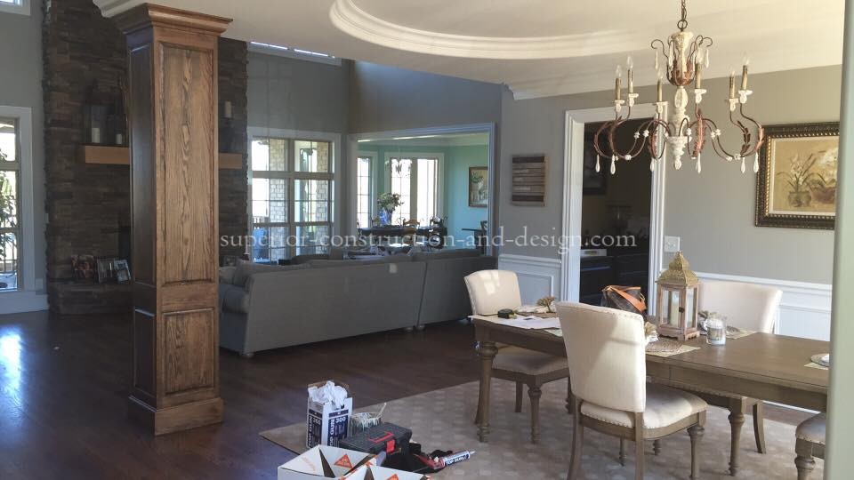
COLUMN
Viewing the dining room from the foyer, you immediately notice the stained column. This architectural feature was placed in the house and plan for support, and to define the parameter of the dining room. By staining the column, it disappears into the den beyond, fades into the stone of the fireplace, and shows no relation to the dining room. However when painted out in the trim color, it provides definition to the space and anchors the dining room.

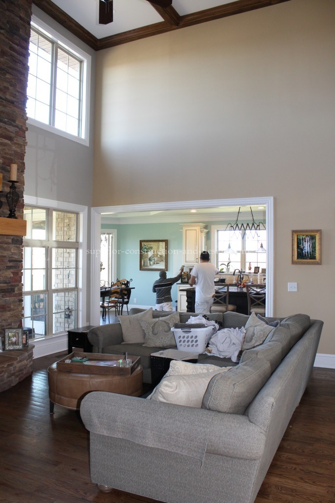
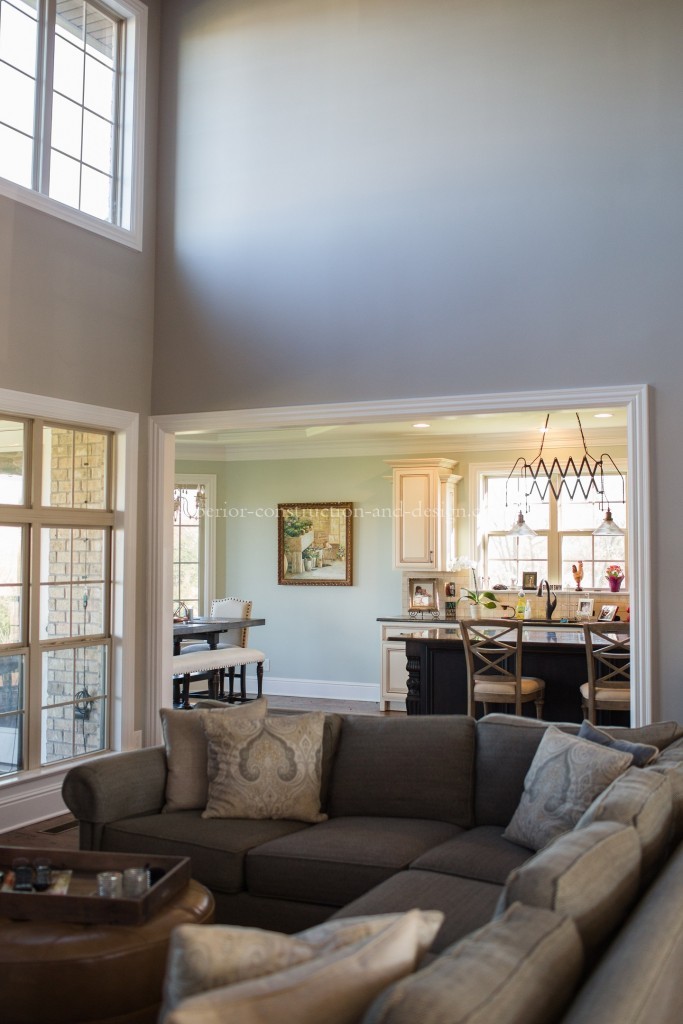
GREAT ROOM
In this great room view, there are three colors with three very different undertones. Identifying them, and choosing hues with complimentary undertones make the new colors work together instead competing with each other. This was a hard sell to my client, Ginger, because she loved her blue in the kitchen. But I believe, if asked, she would say this is one of her favorite changes.
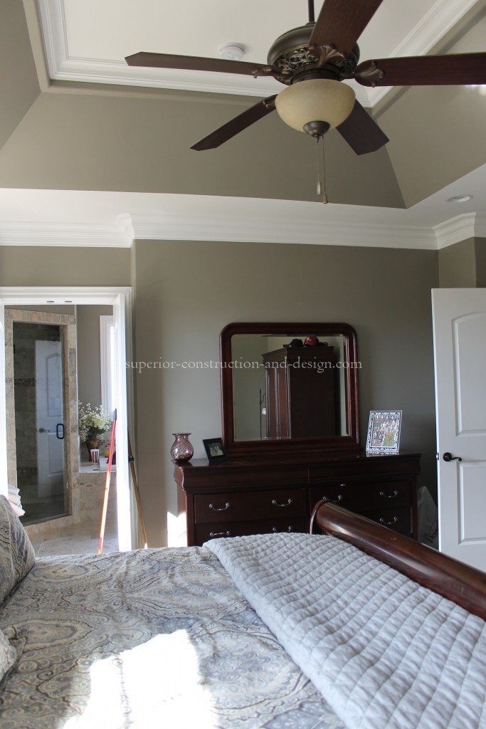
MASTER BEDROOM
In the master bedroom before, the placement of the dark color on the wall and in the tray ceiling created division in the space. By lightening the walls, and raising the dark hue to the ceiling draws your eye up, and makes this large room seem even larger.
Many thanks to my clients, Brad and Ginger Raines, for allowing me to share their incredible home with Wilson Living readers. As of press time, we were not completed with this project. If you want to follow our progress, like Superior Construction and Design on Facebook to see the rest of this breathtaking home. It was especially fun to feature Ginger’s home as she is a mutual client of mine and my Wilson Living: Coming Home photographer Chesley Summar’s.
For more information on Chesley and Ginger:
Chesley Summar: www.chesleysummarphotography.com
Ginger Raines: www.intriguegym.com


Elizabeth,
What you did here is absolutely fantastic!!! What a difference your changes made to this home – you really took it up a notch and made it all look so much more sophisticated and high-end. Your clients must be thrilled, and so should you be with these amazing results. Kudos!!!
Mwah!! Thanks so much friend!
Everything looks so Great and the Article as well…. So proud of you
If Pat will be able to allow us to redo our kitchen I really hope you can help or give me some of that a Great advice.. Vety Proud for YOU
thank you sweet Glenda!!